Wednesday, June 30, 2010

Fiscal and monetary policy are headwinds, not tailwinds


The yield on 2-yr Treasury Notes yesterday dropped to its lowest level ever. As this chart suggests, that means the market has never been so pessimistic about the economy's ability to grow. Short-term Treasury yields typically track the growth of nominal GDP, mainly because they present a risk-free alternative to having exposure to nominal GDP through investments in equities and/or corporate debt. That yields are under 1% for the first time ever suggests the market is expecting that an extended period of recessionary conditions and very low inflation are right around the corner. In other words, 2-yr. Treasury yields provide strong evidence that the economy is already priced to the double-dip recession that so many pundits seem to be calling for.

Let me explain. If nominal GDP is rising 5% a year, for example, then your baseline expectation for the growth rate of corporate cash flows should be something similar. After all, no business can have a cash flow growth rate which exceeds nominal GDP forever, because at some point that business would consume the entire economy. So it stands to reason that on average and over time, corporate cash flows, and profits, will tend to grow by a rate that is close to that of nominal GDP. You can capture that growth rate in your portfolio by holding equity exposure (in the hopes that growth will be positive and you will earn more than 2-yr Treasury yields), or by buying the 2-yr. Treasury if you're not sure and don't want to take any risk.

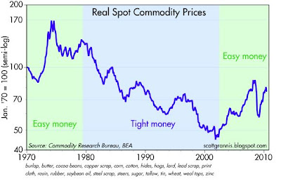
This chart is also instructive because it shows that yields tended to equal or exceed nominal GDP from the early 1980s through the early 2000s. That same period happened to be one in which inflation was generally falling and relatively low. It was also the same period during which the Fed almost always proclaimed that it was pursing a restrictive monetary policy (which involves pushing interest rates up relative to inflation so as to increase the demand for money). But beginning in 2002, the Fed began pursuing an overtly accommodative monetary policy, and this translated into yields generally being less than the growth of nominal GDP.

When 2-yr Treasury yields exceed the growth rate of nominal GDP, investors are naturally drawn to financial assets (e.g., cash, Treasuries), because they tend to outperform nominal GDP on a risk-adjusted basis. But when yields are less than nominal GDP, investors tend to prefer investments which are tied to the physical economy (e.g., commodities and real estate), since they tend to outperform the returns on financial assets. Corporate bonds and equities do especially well when money is tight and real yields are high, because in a tight money environment yields tend to fall and inflation stays low; falling yields make the return on equities look attractive, and so investors tend to bid up PE ratios; PE ratios tend to be highest when growth and inflation are lowest. Low inflation also tends to discourage investments in real assets (like real estate and commodities), and by doing so, low inflation discourages speculation and instead encourages investments in productive activities; low inflation thus tends to lead to stronger growth.

The fact that we've had easy money for most of the past 7-8 years helps explain why equities have performed poorly—with PE ratios declining of late—and corporate bond spreads are still historically wide. It also explains the strong performance of commodity prices, and—until a few years ago—the strong performance of real estate.

I have said this many times before and I'll say it again: the two most significant headwinds facing the economy today (and for the past year) are faux-stimulative fiscal policy and excessively "easy" monetary policy. (This of course flies directly in the face of the common perception that the economy has only managed to recover thanks to stimulative fiscal and monetary policy.) The huge expansion of government regulations and spending under the Obama administration, the fact that most of the spending took the form of transfer payments, and most of the tax cuts were temporary rebates, coupled with the Fed's $1 trillion injection of bank reserves via the purchase of MBS, have done almost nothing to increase hard work and risk taking, while greatly increasing investors' uncertainty regarding the future. How high will taxes have to rise to restore some semblance of sanity to the budget? How can spending be throttled back without creating even more pain and suffering? How high or low might inflation be in the future?

The great economist Allan Meltzer has an excellent op-ed in today's WSJ titled "Why Obamanomics Has Failed." Read it, since it adds a lot more substance to my sparse remarks on fiscal policy here.

It's important to note that these headwinds have been with us for some time, and they help explain why the economy has experienced a sub-par recovery to date. Business investment is improving on the margin, but as I have pointed out before, investment is severely lagging the rise in corporate profits, and a lack of confidence in the future surely helps explain why.

Does this mean we are doomed? No. It's always dangerous to extrapolate recent trends into the future, and that is especially the case today. There is a sea-change underway in the public's willingness to tolerate larger and more intrusive government, and this will very likely result in some huge changes to policy in the wake of the November elections.

Meanwhile, as the chart above suggests, the economy is moving in a positive direction, and the fears of a double-dip recession which have brought the equity market down may well prove to be unfounded. Holding cash or short-term Treasuries because one expects the economy to collapse may prove to be a very expensive hedge, not least because yields on risk-free investments are very close to zero, while yields on alternative investments (equities, corporate bonds, etc.) are historically high.

No signs of acute distress in the bond market


The equity market may be awash in expectations of a double-dip recession, but the bond market is saying there are few if any signs of acute distress. Those two conditions (recession in the absence of acute distress) are not mutually exclusive, but they are rarely found together in the wild.

The evidence for the lack of acute distress can be found in these charts. The TED spread (top chart) is a little elevated, but not unusually so. In fact, at today's 36 bps it is actually lower than its 20-year average of 49 bps. (The TED spread is a good measure of the degree of fear, uncertainty and doubt which inhabits the interbank lending market, and it tends to rise when the market worries about problems that may lead to bank failures.) 3-mo. T-bill yields are the world's standard for risk-free investing, and the fact that yields recently have risen to their highest level in almost one year is a sign that investors' risk aversion has declined somewhat.

I can only speculate as to why all this should be happening, but at the very least it is reassuring to note these developments at a time when the equity market seems to have fallen prey to the predations of the bears. I would venture to say that the end of the world as we know it is NOT the most likely outcome.

Tuesday, June 29, 2010

Corporate borrowing costs unchanged for five years


This chart shows the average yield on BAA corporate bonds over the past 5 years. The latest datapoint is 6.15% (as of June 28th), which is almost the lowest reading on the chart. Corporate bond yields spiked during the recession, when fear of massive corporate defaults was intense and it was difficult if not impossible for just about anyone to obtain credit. Spreads (the difference between corporate and Treasury yields) are about 100 bps wider today than they were in the tranquil 2005-2006 period, mainly because Treasury yields have collapsed. Borrowing costs for the typical large corporation have not risen at all in five years, but the widening of spreads indicates that expected default rates are much higher. It's not that there is a shortage of money in the system today, it's that fears of losses are still running fairly high. The market seems more preoccupied by fear than by reality.

Commercial real estate has taken a huge hit


One more chart to put the home price development in a broader context. This chart compares residential home prices to commercial property prices. Residential prices have fallen about 30% from their peak, while commercial property prices have fallen 40%. Those are serious, significant declines that reflect a huge amount of price adjustment, easily enough to absorb excess inventory. Both charts suggest that we may have found a new equilibrium price. Market participants still fret, however, that this is not the case. Everyone seems to be worried right now that asset prices are poised to decline to new lows, and that this will mark the start of a new depression. I don't believe it. I see too many signs of ongoing improvement: strong commodity prices, rising retail sales, rising incomes, strong manufacturing reports, rising rail shipments, rising container exports, etc.

The June decline in confidence is nothing to worry about


Can the June decline in this measure of consumer confidence (from 62.6 to 52.9) really be the cause of today's stock market plunge? I doubt it—it's more likely investors getting cold feet after seeing China's stock market fall to new lows. As this chart shows, confidence is a volatile thing and only takes on significance when a trend is apparent. If there's any trend in place over the past year, it is upward, so to me that says the June datapoint was just one of those random blips. And in any event, it's natural for consumers to be concerned and confused in the early stages of a recovery, especially this one, since the recession was unusually harrowing. Once burned, twice shy, as the saying goes.

Housing prices have been stable for over a year


The top chart shows real housing prices (deflated by the PCE deflator) based on the Case Shiller composite of prices in 20 large metropolitan markets. The second, which has a longer history, shows a composite of the 10 largest markets. Both send the same message: in inflation-adjusted terms, home prices have been stable for over a year, after a shocking plunge that lasted three long years.

Have prices achieved a new equilibrium? It looks that way to me. Take the second chart, for example. That shows that on average, home prices have increased about 1.5% per year in real terms over the past 23 years. That's consistent with other measures of home prices I've looked at, and could easily be a reflection of the gradually improving amenities and size of the average home over time. Consider also that real incomes have risen about 3% a year over this same period, so in terms of affordability, home prices are cheaper today than they were 23 years ago, not to mention the fact that financing costs are far lower than they were in the 1980s.

Yet the drumbeat of the pessimists has seemingly never been louder.

Credit spreads are still high, but not scary


Here's an up-to-date version of my chart showing 5-year credit default swap spreads on investment grade and high yield bonds, which in turn is a good proxy for generic credit risk in the bond market. Spreads widened in early May on the back of surging fears of a Greek default, but they have since settled back down. High-yield spreads are about 75 bps lower today than they were at the peak of the Greek crisis earlier this month. If I take this chart in the context of swap spreads that are now back down to a "normal" level (2-yr swaps today are 36 bps, after reaching a high of 64 bps on May 25th), I don't see any reason to believe that economic and/or financial fundamentals have deteriorated, much less that a double-dip recession looms large. The current level of credit spreads reflects the continuation of distress, to be sure, but spreads are not even remotely at a level which would suggest another recession.

Monday, June 28, 2010

Inflation is still within the Fed's target range


This index of inflation, the Personal Consumption Deflator, is arguably the best index of inflation from the individual's point of view. It also happens to be the Fed's preferred measure of inflation. Fed governors must be feeling pretty good that despite all the gyrations of the economy and Fed policy over recent years, both versions of this index (headline and ex-food and energy) are within the Fed's target zone of 1-2%.

I must admit that for about the past year I have been expecting inflation to move higher, and so far I have been dead wrong on this. I keep thinking that the Fed's huge addition of reserves to the banking system, coupled with the general weakness of the dollar, the strength in gold prices, the strength in commodity prices, and the steepness of the yield curve, all point to rising inflation, and it is just a matter of time before this occurs. But so far, those who believe that inflation is impossible when the economy is operating well below its full employment level have been right.

This is the kind of error I don't feel too bad about making, since higher inflation tends to have a very corrosive impact on the economy.

Chicago Fed Activity Index still strong


This is the 3-month moving average of the Chicago Fed's National Activity Index. With so many double-dippers out there, I thought it important to highlight an otherwise-obscure index such as this to show that there is very little, if any, data on which to base a recession call. Indeed, as of April this index "suggests that growth in national economic activity was above its historical trend."

HT: Calculated Risk, where you can find a long-term chart of the series as well as more detailed commentary.

Sunday, June 27, 2010

Paragliding in Torrey Pines


Saturday I took a nice break from the routine and went down to Torrey Pines (just north of La Jolla in San Diego County) to try paragliding for the first time ever. It was a very nice present from my brother Dick, and one of the highlights of my life. This is a picture of me sitting in front of an experienced pilot. The views were breathtaking, and I won't even try to describe it. I'm told that the Torrey Pines gliderport is one of the best—and safest—places in the world to do this sort of thing, and I don't doubt it for a second.

Friday, June 25, 2010

Corporate profits look very strong


With the final revision to Q1/10 GDP released today, we see a nice upward revision to corporate profits, which were already pretty strong to begin with. In the top chart the blue line reflects total after-tax corporate profits, while the red line shows the profits of nonfinancial domestic corporations. Note how the latter has surged by 83% since the low of late 2008; this means that your average home-grown company's profits have nearly doubled since the depths of the recent recession. That the red line has risen proportionately more than the blue means that the profits of financial corporations have lagged, which is not surprising given all the problems in the banking sector.

Pessimists would be quick to note that profits are now almost as high, relative to GDP, as they have ever been, and thus there is nowhere to go in the future but down. I would counter that by noting that corporate profits have doubled since 1998, long before the equity market reached bubble territory, but equity valuations as measured by the S&P 500 have not risen at all in the intervening years on net. I think this makes a strong case for stocks being undervalued today, depressed by, among other things, a) fears of a double-dip recession, b) anticipated future tax hikes, c) increased government regulation, and d) worries over how the Fed is going to unwind $1 trillion of monetary stimulus. It's not a secret that there are all sorts of problems out there, and there is no shortage of things to worry about these days. These numbers suggest that the market has already discounted a lot of problems, if not all of them. So if anything starts to move in a positive direction (e.g., the November election results in a big mandate to cut spending and avoid tax hikes), then the market should have plenty of upside potential.

Rising consumer confidence is a good sign


Consumer confidence is anything but a reliable leading indicator of the economy's health, but this time it may be. That it is still relatively low from an historical perspective simply reflects the fact that we've through a pretty rough recession. Confidence was deeply shaken, and it takes time to rebuild. Recessions typically happen when everyone is very confident, because then the unforeseen can be terribly disruptive. But now most folks are still looking cautiously around every corner and under every rock, worried that the unforeseen may strike again. This is quite normal and consistent with the early stages of just about every recovery. That confidence has been slowly rising for the past year is more encouraging this time around, since the latest recession was all about a huge shock to confidence (i.e., widespread fears of a global financial meltdown), so as confidence returns, money that was socked away under mattresses gets gradually spent, and that helps economic activity recover. We are in the midst of a virtuous circle, where rising confidence boosts spending, rising spending boosts production, and rising production boosts confidence, etc.

Thursday, June 24, 2010

Financial conditions are not all that terrible


This is a chart of financial conditions as measured by Bloomberg. It "combines yields spreads and indices from the Money Markets, Equity Markets, and Bond Markets into a normalized index. The values of this index are z-scores, which represent the number of standard deviations that current financial conditions lie above or below the average of the 1992–June 2008 period."

Yesterday the index registered -.92, which is better than the May 20th low of -1.53 and far better than what we saw in the runup to the Lehman crash. Swap spreads in the U.S. are about average, the Vix index is elevated (just under 30 today), and European swap spreads are elevated (2-yr swap spreads are just under 80 bps). The world is very worried about a Greek default or restructuring, as evidence by the 950 bps spread between 2-yr Greek and German bonds (bottom chart), enough so that it would be surprising at this point if Greece did not default; a significant default is effectively priced into the market today. In short, things could be a lot better, but this is hardly a crisis, disaster or a replay of 2008.

Weekly claims lower than expected


In a departure from the behavior of most economic statistics of late (when reports were not as good as expected), weekly unemployment claims in the latest period were a bit lower than expected (457K vs. 463K).  The 4-week average move up a bit, but the trend since January is downward-sloping (though not by much—see second chart). The pace of improvement may be disappointingly slow, but the economy nevertheless continues to strengthen.


The pace of business investment is strong, but the level is still disappointing


New orders for capital goods in May were 17% higher than a year ago, and that amounts to very strong growth in business investment. At this pace, capital spending will regain its 2008 high in about a year. That's much faster than the recovery from the 2001 recession, when it took six years to recover to previous highs. But as impressive as is the growth rate of business investment currently, the level is remarkably low, given the absence of growth over the past 10 years. Moreover, corporate profits after tax have doubled over the past 10 years, yet business investment is flat. Cash is piling up in corporate coffers, and much of that cash is effectively being borrowed by the federal government to fund its deficit.

While things are definitely improving on the margin, the underlying strength of the economy is being undermined by deficit-fueled government spending that we can be sure is far less productive than if the same amount of money were being spent by the private sector. Once again, a reason to expect that overall growth in the economy will be less than robust (which, given the depths of the prior recession would be on the order of 6-8%), but still somewhat better than average (long-term trend growth is probably 3%). So I'm sticking with my forecast of 3-4% growth over the next few years.

Wednesday, June 23, 2010

It's about time: austerity is the new fashion in Europe

From the Washington Post: "Britain announced a far-reaching deficit-reduction plan Tuesday aimed at saving billions of dollars over the next five years, becoming the latest European nation to slash spending amid increased worries about rising public-sector debt."

It's not perfect news, though, since about one-fourth of the deficit reduction will supposedly be achieved by increased taxes, but it's a good start. The spending cuts are impressive in that they target spending programs directly, and the same thing is happening in Germany and France. "Britain's decision to cut rather than spend follows a wave of austerity packages recently unveiled across Europe, including almost $100 billion worth of cuts in Germany and public-sector pension reforms in France."

Obama, of course, cautioned the Europeans to avoid premature austerity measures since they might harm economies. The market, however, reacted to the news by boosting the value of the pound (up 13% in the past month); plus, German stocks are up about 10% in the past month, and UK stocks are up 5%. If too much spending causes huge deficits and raises fears of huge tax increases (a bad thing in the eyes of investors), then cutting back on excessive spending can only be a good thing.

This U.S. needs to join this party, and the sooner the better.

UPDATE: This party is spreading around the world to Australia: "Julia Gillard became Australia's first female prime minister after Kevin Rudd stepped aside as leader of the governing Labor Party, paving the way for the government to drop a controversial new 40% levy on mining profits that has damaged its standing in voter polls." http://online.wsj.com/home-page?mod=djemalertNEWS

Not to mention the many municipalities and states that are now being forced to look at trimming out-of-control pension obligations.

UPDATE: The WSJ has a great op-ed which summarizes the failure of Keynesian stimulus efforts around the world, and how the political tides are turning against them.

Fed remains in reactive mode, which is not helpful


Today's FOMC statement made no contribution to the market's understanding of the economy or the future course of Fed policy. The Fed knows just about as much as the market about what's going on—the U.S. economy is probably still growing, but there is the risk that the Euro debt crisis could be contagious. From a longer term perspective, the Fed is managing policy by looking in the rearview mirror, trying to nurse a sick economy (sick because it is almost 10% below trend growth) back to health with cheap money. Fed policy remains about as easy as it has ever been, as this chart suggests.

Fed governors, with the exception of Kansas Fed President Hoenig, have no interest in the message being sent by strong commodity prices, soaring gold prices, and the generally weak level of the dollar—namely, that money is in abundant supply and there is almost no chance that Fed policy is posing any problems for the economy. If anything, ongoing monetary accommodation may be fueling unrest among investors who worry about how the Fed's addition of $1 trillion to bank reserves will be unwound and what problems that may create in the interim (e.g., rising inflation, asset price bubbles).

Investors also worry about fiscal policy, which has been incredibly "stimulative" according to the Keynesian framework. Very easy money plus very stimulative fiscal policy for the past 18 months and we only have a modest recovery that is at risk of a Greek debt default? Yikes, maybe the economy is hanging by a thread...

A better way to understand things is from a supply-side/monetarist/classical economic perspective. Easy money can't create growth, it can only create inflation. Deficit-fueled spending also can't create growth, especially when, as now, it consists mostly of transfer payments that simply redistribute wealth in a way that weakens incentives to work and invest. Huge deficits and huge new government spending programs (e.g., Obamacare) further weaken investor confidence since they hold the threat of a major increase in future tax burdens. A lack of investor confidence in the future stability and strength of the dollar and the future level of tax rates and tax burdens equates to uncertainty, and uncertainty is bad for investment. If investment is weak, then economic growth is hard to come by. It takes hard work and risk-taking to create new companies and new jobs.

So the more the Fed tries to pump up growth with low interest rates, and the more Congress tries to pump up growth with new spending schemes, the worse it is for the economy. There is a dreadful lack of understanding of the basic principles of economics in Washington, especially among the Obama administration and members of the Democratic Party.

I believe that the market has been worried for a long time about the course of fiscal and monetary policy. Investors and risk-takers understand how things work much better than most politicians do. There are abundant signs of just how concerned the market is, from zero interest rates on cash to 3% interest rates on 10-yr Treasury bonds, and from above-average credit spreads to historically high implied volatility and $1200 gold prices. Morever, equity valuations have severely lagged the growth in corporate profits.

In this view of the world, the market advance to date has largely occurred despite the bad news from Washington, the Fed, and the Greeks, and the economy is recovering despite all the headwinds, thanks to the inherent dynamism of the U.S. economy and a free people's innate desire to improve their lot in life by working harder and finding ways to do things more efficiently. It's not a huge recovery or even a typical recovery, given the depth of the recent recession, but it is a recovery and it is likely to continue.

The one bright spot on the horizon, and something that could make a huge difference to the economy and the markets, is the upcoming November elections. It is the hope—and the increasing likelihood—that these elections could yield a significant rightward shift in fiscal policy that is sustaining what little optimism can be found. I think it's hard to underestimate the importance of this, because all the signs on the margin point to a sea-change in the public's attitude toward fiscal and monetary policy. When and if this change translates into an improved policy outlook, we could see an explosion of optimism, and that would be a very good thing indeed.

New home sales distorted by incentives


The big drop in new home sales in May was most likely "payback" for strong sales in April, which in turn were fueled by people rushing to take advantage of the soon-to-expire homebuyers tax credit of $8,000. As Brian Wesbury notes, the underlying level of sales is consistent with the very low level of new construction we have seen for the past year, and does not therefore represent any new deterioration in the economy. Bear in mind as well that residential construction has fallen to its lowest level relative to the economy (just over 2% of GDP), so even if new home construction were to weaken substantially from here it would have a minimal impact on the overall economy.

... new homes were sold at a 446,000 pace in April, but fell to a 300,000 rate in May. The underlying trend is probably in between, or 373,000 per year. For comparison, in the past two months, single-family homes were started at a 517,000 annual rate. Of the 517,000, we estimate that roughly 150,000 do not need to be sold because the plot has already been sold. That leaves 367,000 per year that need to be sold (517,000 minus 150,000), which is right in-line with the pace of sales. In other words, as bad as today’s report was, it does not signal a need for home builders to slow down the pace of construction. Confirming this, today’s report showed that the inventory of new homes declined 1,000 to 213,000, the lowest level since 1970.

Strong growth in the hiring of temp workers


With a HT to Mark Perry, who has been following this index for some time, I offer this version of his chart that includes an extra year of data. This index "estimates weekly changes in the number of people employed in temporary and contract work," and as Mark notes, the index "is considered to be an accurate leading indicator of employment trends," especially when the economy is coming out of a recession. Indeed, the index started rising beginning in July of last year, six months prior to a rise in the household survey measure of private sector employment.  It has risen 25% from the year-ago period, a strong sign that business activity is expanding and permanent hiring will continue to rise.

Putting commodity prices into perspective


This chart shows the entirety of the bull market in commodities which began in late October, 2001. The index shown is composed of very basic industrial commodity prices (e.g., burlap, butter, cocoa beans, copper scrap, corn, cotton, hides, hogs, lard, lead scrap, print cloth, rosin, rubber, soybean oil, steel scrap, steers, sugar, tallow, tin, wheat, wool tops, and zinc), many of which do not have associated futures contracts, and therefore are less likely to be influenced by speculative activity. From its time high last April, the index is down a mere 4.5%, and it is only  11.4% below its all-time high in July, 2008.

We can only speculate about the combination of forces that has driven commodity prices up 107% in just under 9 years (7.8% annualized). But the likely candidates would be: strong global growth, particularly in China and India and most emerging market economies; accommodative monetary policies from most of the world's central banks; and the inability of commodity producers to keep up with demand, following a period (from the mid 1990s to the early 2000s) in which very tight monetary policies had severely depressed demand for commodities.

To explore the possible contribution of monetary policy to today's commodity prices, I offer the following chart, which plots the same CRB Spot index in real terms (using the PCE deflator).


The three periods shown in the chart correspond to major monetary policy eras: the easy money of the 1970s, which led to sharply rising inflation and a commodity booms; the tight money that began with Fed Chairman Volcker and ended in the wake of the dot-com disaster; and the easy money that has characterized monetary policy since the Fed began to worry about a weak economy and deflation risks in 2003. One thing should be obvious, and that is that today's prices are relatively cheap from a long-term historical valuation perspective. Prices haven't yet recovered to the levels that prevailed in 1970 (and prices were relatively flat from 1960 to 1970). The other obvious point is that monetary policy can have a major impact on commodity prices.

In any event, I don't see the rationale for why there is necessarily a commodity price bubble, or why there should be a bursting of the bubble. From a long-term perspective, commodities might be considered to be still in the early stages of a recovery from very depressed levels. Julian Simon, if he were alive today, would argue that commodity prices in real terms should have a strong tendency to decline over time, since man cleverly invents new and more efficient ways to extract commodities, and more efficient ways to use commodities. But even if you believe this, today's price action is not anomalous.

Shipping update--looking better and better


The Harpex index of container shipping rates in the N. Atlantic has almost doubled so far this year, after having plumbed unimaginable lows. That's a V-shaped recovery in my book, even though rates have yet to regain their pre-crisis levels, and at the very least it severely weakens the bear case for European growth.

Update: At the request of a reader, here is a chart of the Baltic Dry Index, which measures shipping costs for bulk commodities in the Pacific. The index is enormously volatile, and has dropped 40% in past month. But as the chart shows, it is still up significantly from its end-2008 lows. As recently as 2001, today's levels would have been considered almost impossibly high. I think today's reading is consistent with an ongoing global economic recovery.

Tuesday, June 22, 2010

Further evidence the Euro scare is passing


This chart of 3-mo. T-bill yields is further evidence (in addition to the decline in swap spreads, credit spreads, and the Vix index) that the mini-panic over Eurozone debt defaults is passing. Such was the panic a week ago that investors were willing to sacrifice almost all yield in order to enjoy the safety of T-bills. Rising T-bill yields today are equivalent to the market breathing a huge sigh of relief.


As this chart of 10-yr Treasury yields shows, however, the market is still very concerned about the future of the U.S. economy. Investors are willing to accept 3.2% yields on 10-yr Treasuries only because they have a very dim view of the economy's ability to grow, and because they remain concerned about the threat of deflation. So between the two charts we see that while the market is no longer absolutely terrified of another financial meltdown, it is far from being optimistic about the future. Reading the bond market tea leaves is how I come to believe that valuations in the equity market remain relatively depressed.

Housing market continues to stabilize


Sales of existing homes "fell unexpectedly" in May, according to today's headlines, but as the top chart shows, they remain 15% above what appears to be the floor level of sales for the past two years. The housing market is almost certainly not in a V-shaped recovery (I'm discounting strong sales during the April-May period because they were likely influenced by the expiration of the $8,000 tax credit program), but neither is it showing any signs of another collapse. This is a drawn-out "U" shaped recovery if anything. The important things to note are these: the housing market peaked about five years ago; sales and prices declined for about three years; and things appear to have stabilized for the past two years. We're five years into this downturn in the housing market, and sufficient time has passed and enough adjustments have occurred (median home prices have fallen roughly 25% since 2005) to support the view that things are going to slowly get better instead of getting worse.

You don't need to see housing moving up to be optimistic, you only need to know that the housing market has stabilized. Stable prices come first, then higher prices. (Actually, prices in May were up about 2% from a year ago.) As long as prices no longer decline, then the prices of mortgage-backed securities can stabilize and eventually rise. (And actually, some home-equity-backed security prices are up 17% from their year-end levels.)

Monday, June 21, 2010

Spread update—good news on the margin


Just an update to show that, as of last Friday, credit spreads had reversed about half of their recent widening. The scare that started in Euroland with the Greek debt crisis and threatened to spread to the U.S. economy is passing. Given the action in HY debt funds today (higher prices), it's a safe bet that spreads today were lower than is reflected in the charts. Good news.

Dollar weakens against the yuan


Most observers are cheering China's decision over the weekend to allow its currency to once again appreciate against the dollar (top chart), and I agree that it is probably a good thing, if for no other reason than that it reduces the risk that U.S. politicians will screw things up by starting a trade war with China.

But it's also a good thing for China itself, since a stronger currency reduces the risk of higher inflation, which was already uncomfortably high and rising (second chart). A stronger currency will also lead to higher Chinese living standards, since the purchasing power of Chinese incomes will rise in proportion to the yuan's rise against other currencies.

But instead of focusing on the stronger yuan, I think the real focus should be on the dollar. What the Chinese are doing is withdrawing their support of the dollar—effectively voting against the dollar. They were buying dollars and otherwise accumulating reserves in order to keep the yuan pegged at 6.83 to the dollar. If they hadn't taken enforced the peg, then presumably net capital inflows would have driven the yuan higher at the expense of the dollar. So now they will buy fewer dollars and allow the yuan to rise. (I made some more extensive comments on the history of the yuan's link to the dollar here, but in rereading the post I note that my conclusion—that the Chinese would only revalue if the dollar weakened further, which it hasn't—was wrong.)

The Chinese decision also highlights the dollar's fundamental weakness. Being pegged to the dollar meant that China experienced the full effects of U.S. monetary policy. Rising Chinese inflation is strong evidence that the Fed has been too easy, and that the dollar has been too weak. Chinese inflation is like the canary in the coal mine for U.S. inflation—monetary policy acts faster in the Chinese economy because it is much smaller and more dynamic. Plus, trade is much more important to the Chinese economy than it is to the U.S., so changes in the value of the yuan, which have been primarily driven by changes in the dollar's value, flow through to the general price level faster in China than they do in the U.S.

By revaluing against the dollar, China will experience a tightening of monetary policy. And, by reducing the demand for dollars, China's action will result in a further easing of U.S. monetary conditions. Therefore, inflationary pressures in China will diminish, while they will increase in the U.S.

I doubt that this decision will prove to be of great benefit to U.S. exporters, but it should be of some benefit on the margin since a stronger yuan will make all imports cheaper for Chinese consumers. One collateral effect of this is that Chinese demand for commodities will strengthen, and that is likely to push commodity prices higher over the long run.

China's decision is likely to be detrimental to U.S. consumers since the prices of Chinese imports will tend to be higher than otherwise. But that is just another way of saying that what really happened today is that U.S. monetary policy has effectively become easier—through a weaker dollar—and that will eventually increase U.S. inflation. Higher U.S. inflation, in turn, will tend to drive Treasury yields higher.

At the very least, this decision adds to the reasons why deflation is not a serious risk. And to the extent that deflation is not a risk, that brightens the outlook for the U.S. economy, and, in turn, for risky assets in general.

Natural gas rebound


Natural gas prices have been extraordinarily volatile over the past 15 years, and the recent experience is no exception—at today's $5.12, prices have more than doubled since last September, yet they are still less than half what they were in 2008. I don't pretend to understand much about this market, but I note that the recent rally may be due to hedge funds that are being forced to buy back their short positions. Presumably they thought that massive new gas discoveries would combine with a weak economy to keep prices depressed. Commodity price speculation can cut both ways, as those who were betting on deflation have now learned.

Friday, June 18, 2010

The decline in the Vix and swap spreads looks very bullish for stocks


The Vix index has dropped to 24 after spiking to 48 on May 21st. 2-yr swap spreads are now back to "normal" levels of 34 bps, after spiking to 64 on May 25th. The surge in the Vix and in swap spreads preceded the slump in the S&P 500, which reached a low on June 4th. It would appear to me that with fear, uncertainty and doubt fading fast, the equity market looks poised to enjoy some handsome gains in the days and weeks ahead.

Here's a close-up of the Vix and swap spreads:

Thursday, June 17, 2010

Household financial burdens continue to decline, and that is good


The Federal Reserve today released their estimates of households' financial burdens, and the news continues to be good. The chart shows two measures of financial burdens: mortgage and consumer debt payments as a percent of disposable income (red), and total financial obligations (mortgage and consumer debt payments, auto leases, homeowners' insurance, and property tax) as a percent of disposable income. By either measure, financial burdens are no greater today than they were in the mid- to late 1980s. There is no evidence at all to support the notion that households are over-extended or at risk.

Households have been hard at work deleveraging their finances since the peak of 2007, but they were never seriously at risk to begin with. I've been showing this chart since Dec. 2008, when I argued that "once the financial system finishes writing down the value that has been lost to plunging housing values and collapsing commodity prices, we will discover that the basic economy (the consumer) is still in reasonably good shape." And so it appears today.

I would also point out that while so many commentators fret that deleveraging poses a serious threat to the economy's ability to grow, that is not the case at all. Consider that there has been considerable deleveraging since 2007 (as shown by the decline in financial burdens in this chart), but meanwhile the economy hit bottom about a year ago and has been growing ever since. Economic growth can be facilitated by increased debt, but debt is not essential for growth, nor does declining debt mean that growth must reverse.

Another high for gold portends higher commodity prices


Gold today closed at yet another new high against the dollar. The euro has jumped against the dollar of late, so gold is about €30 off its highs against the euro; ditto for the yen. The big story, however remains that all currencies have lost significant ground to gold in recent years. That all currencies have lost so much value against a gold benchmark at the same time overwhelms the movements of one currency vis a vis another.


As this next chart shows, gold is highly correlated with commodity prices (0.86 over this 30-year period), and gold tends to lead commodity prices. I've heard many arguments for why gold is marching to the beat of its own drummer these days (e.g., the Chinese and the Indians are flush with money and can't help but spend it on gold), but I would argue that it is very hard to dismiss gold when you consider how gold and commodities have tracked each other over the decades. Commodity prices have dipped a bit since April, but they are already on the rebound, and this chart suggests they could have substantial upside remaining. This would add significant fuel to the inflationary pressures that are already building (see earlier post).

A weaker dollar reflects good news for the U.S.


It's time to revisit this chart, since important changes are afoot. The dollar has suffered a sharp reversal in the past 10 days that coincides almost exactly with a rebound in equity prices. (Note that the dollar is plotted in inverse fashion, so the rise in the red line reflects a decline in the dollar's value.) This development most likely reflects a decline in concerns over whether the Euro debt crisis could threaten the global economy via another banking crisis. Demand for the dollar as a safe haven has declined, at the same time that the outlook for the U.S. economy—which so far shows few if any signs of Euro debt contagion, as reflected in the recent decline in swap spreads back to more normal levels—has improved. The Euro crisis remains a big concern in Europe, but markets are breathing a sigh of relief now that it appears that it will not be a serious threat to the U.S. or to the global economy.

It's not often that a weaker currency implies good news for an economy, but this appears to be the case now.

Inflation pressures are building in the production pipeline


These two charts compare headline and core inflation at the producer and consumer level. While it's true that the recent inflation statistics have been relatively mild (e.g., the recent two-month decline of 0.23% in the CPI) this year, if there is one thing these charts show it is that inflation at the producer level is rising relative to inflation at the consumer level. Note how year over year PPI inflation was consistently below that of the CPI throughout the 1990s and into the early 2000s (this is quite clear on a core inflation basis). Since 2003 the PPI has tended to equal or exceed the CPI on both a core and headline basis.

One reason for the difference between producer and consumer inflation is that commodity prices have a more direct and immediate impact on producer prices than they do on consumer prices. Commodity prices were very weak in the 1990s and through 2001, but they have been very strong since 2002. Same goes for the dollar, which was generally strong from 1990 through 2002, and generally weak ever since, and that ties in directly with the stance of monetary policy, which was generally tight throughout he 1990s and early 2000s, but has been accommodative ever since. A strong dollar helps keep commodity prices low, and it also tends to keep import prices low. Monetary policy, in short, is currently acting to boost inflation in the early stages of the production pipeline, and easy money will allow that inflation to eventually pass through the pipeline to reach the consumer. Call the PPI an early warning indicator of what is going to be happening to the CPI in a year or two.

Another reason for the difference is that consumer inflation is being kept low due to the very weak housing market, which in turn has put downward pressure on homeowners' equivalent rent, which represents about one-third of the CPI and which has declined (for the first time ever) by 0.3% since last August.

I think it's appropriate to focus on the monetary fundamentals here, and thus to pay more attention to the producer price index than to the CPI. That leaves me with the observation that inflation is currently running between 2-4%, as I noted in yesterday's post, not the 0-2% that is being registered in the CPI.

Leading Indicators still point to growth


I'm not a big fan of the Leading Economic Indicators published by the Conference Board, but as this chart suggests, there is not a whiff of evidence in these indicators that suggests we might be approaching a double-dip recession. Indeed, the behavior of the index is very much in line with what it has been in the early stages of every recovery over the past 50 years.

Wednesday, June 16, 2010

A strengthening economy calls for tighter Fed policy


I've been intrigued by this chart for a long time. What I think it shows is that the Fed has typically been very responsive to the state of the economy's health. The capacity utilization rate, shown in the blue line, is a pretty good proxy for how strong or weak the economy is. The real Fed funds rate (using the core PCE deflator) is a good proxy, in my view, for how easy or tight Fed policy is. In the view of those like the Fed that believe in the Phillips Curve theory of inflation, capacity utilization is also a decent proxy for the amount of "resource slack" in the economy, and thus an important input to monetary policy decisions. The logic goes like this: the lower the rate of cap utilization, the more idle resources there are, and the more idle resources, the greater the deflationary pressures on prices, so the more the Fed ought to ease. With cap utilization rates now rising rather rapidly, it would follow that monetary policy ought to begin to tighten.

The Fed doesn't always follow this model, however, as well as it probably should. As this chart shows, there are times when the Fed is proactive (tightening in advance of increases in capacity utilization with the aim of slowing the economy and thus preventing inflation from rising), and there are times when the Fed is reactive (responding with a significant delay to changes in capacity utilization). These different policy responses generally lead to inflation consequences. For example, the Fed was reactive throughout most of the 1970s, and inflation rose substantially. The Fed was proactive from the early 1980s through 1987, and that was a period of significant disinflation (falling inflation). The Fed was then reactive from the early 1990s through 1998, but inflation was relatively low and stable during that period, perhaps because the Fed had been so tight for so long in the decade prior. Since the early 2000s the Fed has generally been reactive, tightening policy with a significant delay in the wake of the strong economic pickup that started in mid-2003. Not surprisingly, inflation accelerated from 2003 through 2008.

The past year or two stand out as unusual in two respects: 1) the economy weakened sharply and to an unprecedented degree, but 2) the Fed took only limited action to ease. The latter can be explained away by noting that although the Fed could not deliver the negative interest rates, as their model (akin to the Taylor Rule) would have called for, it did engage in massive quantitative easing by expanding bank reserves by more than $1 trillion. In any event, we observe that for the past 18 months or so, inflation has been generally tame—does that not mean the Fed has done exactly the right thing?

I'm not ready to say that I have more respect for the Fed or their model of inflation, but I also don't want to ignore the facts. Of course, even the best model can have problems if political considerations overrule the model's policy prescriptions. In any event, going forward this model is saying that the Fed should begin raising rates sooner rather than later, otherwise it will end up committing the sin of reactivity that plagued monetary policy in the 1970s. It's something to think about.

A story of two spills


Source. HT: Dick Grannis

Time and culture


This is completely off-topic, but I highly recommend watching this very cool 10-minute video which is an illustrated talk about how our perceptions of time and our cultures are intertwined.

HT: Steve Root

Producer price inflation update


Here's the latest update on inflation at the producer level. The core PPI is only up 1.3% in the past year, but it is up at a 2% annualized pace over the past six months. Total inflation is up 5.1% over the past year, and 3.6% annualized over the past six months. Draw a line down the middle at you might conclude that the underlying rate of producer price inflation is somewhere in the range of 2-4%.


I like this next chart, which plots the level of the producer price index on a semi-log scale. The chart divides inflation history into "regimes" that are in turn based on the stance of Fed policy.

The Fed was effectively a passive entity in the early 1960s, because we were on a strict gold standard. Not surprisingly, inflation was effectively zero back then. Beginning in 1966 the Fed began to stray from the gold standard, keeping interest rates low in spite of a gradual outflow of gold, and inflation became significantly positive. Inflation took off beginning in 1974, in the wake of the devaluation of the dollar, and the Fed was ineffectual at trying to stop it all through the 1970s. The Volcker Fed then brought it back into control in the early 1980s. But for the past six years inflation has been more volatile and generally higher than at any time since the early 1980s. Since 2004 the underlying rate of inflation has been about 3.5%. 2004, not coincidentally, was when the Fed switched to an overtly accommodative policy stance after having been generally restrictive since the early 1980s.

Inflation is not dead, it is alive and well. Deflation is not a risk.