Thursday, January 29, 2015

Walls of worry persist

The market is still climbing walls of worry, and that's a good sign.

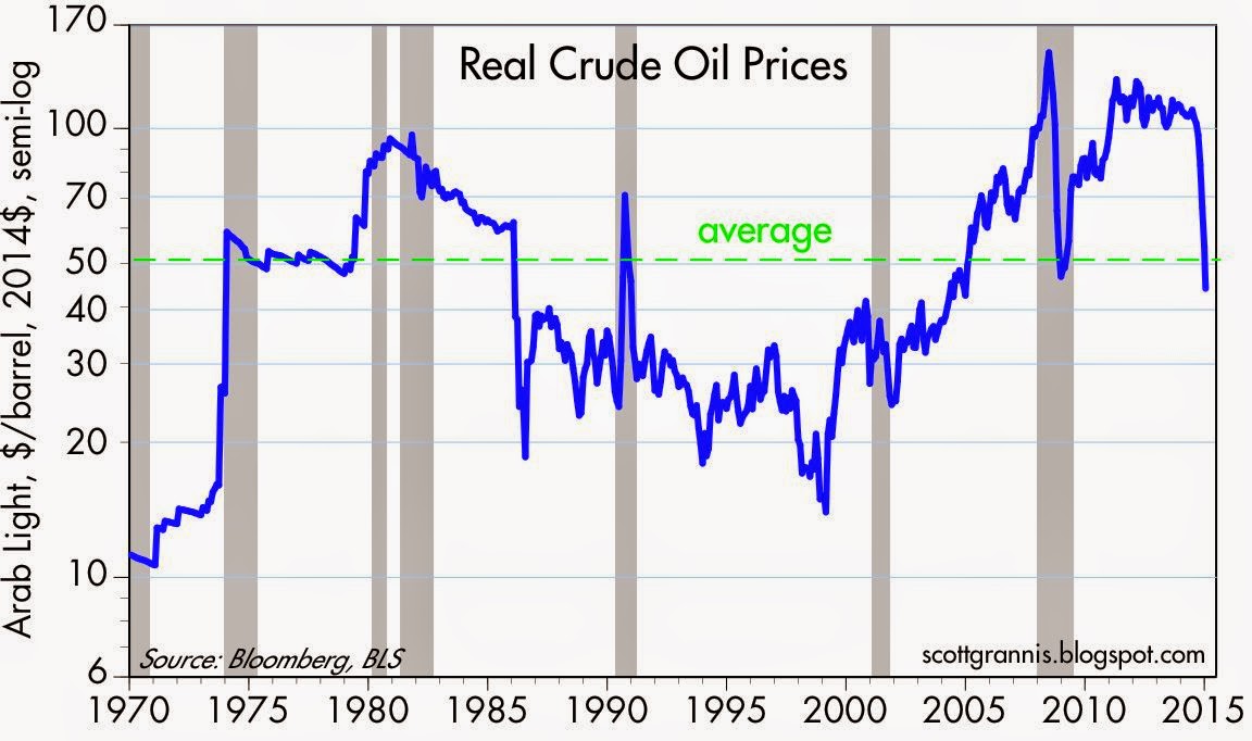
As I see it, here's the bearish case for equities: The Fed is no longer "printing money" and is soon going to begin to raise short-term interest rates. The market has enjoyed a great party for years, but the Fed is about to take the punchbowl away. Equity valuations are stretched, and earnings reports are turning mixed. The energy sector has been savaged, and there may well be nasty ripple effects: layoffs and defaults. China is in a slump and over-burdened with debt. Europe is in another slump and no amount of QE is going to make things better. Countries all over the world are trying to devalue their currencies in the hopes this will boost exports—but that's a fool's game. Policymakers have run out of tools to stimulate growth; growth is likely to be meager for the foreseeable future. The market's enthusiasm is likely to founder on the rocks of slow-growth reality.

In contrast, here's what I think the bullish case for equities is: QE was never about printing money; it was mainly about transmogrifying notes and bonds into T-bill substitutes in order to accommodate the world's demand for safe assets. Confidence is returning, however, and demand for safe assets is declining, so ending QE was the right thing to do. The economy still has plenty of unused capacity, but growth has definitely picked up in the past year. Congress is very unlikely to raise taxes, and may even succeed in lowering them, especially for corporations. Regulatory burdens are more likely to lighten than to increase further. Even if interest rates start moving up soon, they will still be very low relative to inflation for a long time. Equity valuations are no longer cheap, but relative to the yields on safer assets, equities still look quite attractive. There are still plenty of signs that the market is cautious, and that worries are more prevalent than exuberance. Absent a recession—which looks unlikely—equities are likely to outperform most other asset classes because of their superior earnings yield.

Here's how I read some of the more important market-based tea leaves:


The chart above represents the yield menu that investors have to choose from. If you don't want to bear any risk, you are not going to earn anything on cash. Cash (and cash equivalents such as 3-mo. T-bills) yields zero because the demand for safety is extremely strong. The market seems indifferent between owning equities with an earnings yield of about 5.5% and owning cash, with a yield of zero. That can only be taken as a sign that the market is still quite risk averse.


Risk aversion can also be seen in the chart above, which shows that spreads on corporate bonds have risen meaningfully from their recent lows. When confidence and the appetite for risk are strong, spreads are tight; that is not the case today. But doesn't the recent rise in credit spreads signal a coming recession? I don't think so, since swap spreads—the best leading indicator of economic and financial trouble on the horizon—are still quite low. Systemic risk is low, but there's still a lot of worrying going on, and that makes for a healthy market environment. The time to get really worried is when the market is priced to perfection. As it was in early 2000, when the economy was expected to grow 4-5% per year indefinitely.


The chart above shows that the market has been climbing walls of worry (worry being quantified here by the ratio of the Vix index to the yield on 10-yr Treasuries) for most of the past several months. The Vix index is high, which means investors are willing to pay up for the relative safety of options. The 10-yr Treasury yield is quite low, which means investors don't expect the economy to be very strong.


The chart above shows that the earnings yield on equities is significantly higher than the yield on 10-yr Treasuries. This is a clear sign that the market worries that the outlook for corporate profits is troublesome, to say the least. During times of strong growth (e.g., the 1980s), the earnings yield was well below the yield on 10-yr Treasuries. The equity risk premium has been unusually high for several years, during which time equity prices have marched continually higher. It's been climbing walls of worry all the way up.


The chart above compares the earnings yield on equities to the price of 5-yr TIPS (I use the inverse of their real yield as a proxy for their price). When the price of TIPS peaked in 2012, that was a sign of extreme risk aversion: the market was willing to pay a huge price for the relative safety of TIPS, which are default free and inflation-protected. At about the same time, the earnings yield on equities was also at or near a peak, which reflected great distrust concerning the outlook for corporate profits. In the past few years, demand for TIPS has weakened and confidence in the future of corporate profits has improved. But both are still far from where they would be in "normal" times. The market has become less fearful, but it is still somewhat risk averse.


As the chart above shows, it's unusual for the earnings yield on equities to exceed the yield on BAA corporate bonds, as has been the case for the past several years. Bonds are senior in the capital structure to equities, so they should normally yield more, especially since they don't have the upside price appreciation potential that equities do. Today's level of yields suggests that the market is still willing to "pay up" for the relative safety of bonds.


The prices of gold and 5-yr TIPS have been declining for the past two years, as shown in the chart above. (Here again I use the inverse of the real yield on TIPS as a proxy for their price.) Yet both are still high from an historical perspective. The demand for these two unique assets has weakened as the market has regained some confidence in the future, but they are still relatively expensive. The inflation-adjusted price of gold over the past century has averaged almost $600/oz., which is half of today's price. The average real yield on 5-yr TIPS since 1997 is about 1.4%, which is substantially higher than their current real yield of -0.2%.


As the chart above suggests, the real yield on TIPS should tend to track the real growth potential of the U.S. economy. GDP growth has picked up over the past year or so, and real yields have moved higher, both of which are good signs. But real yields remain quite low relative to the almost 3% rate of real growth over the past two years. That's a sign that the market is dominated more by worries than by exuberance.

Wednesday, January 28, 2015

Why I still like Apple

I've owned AAPL ever since 2002, and since late 2008 I have made numerous bullish posts on the company. Given yesterday's stellar earnings announcement—Apple set an all-time world record for quarterly profits—it's time to take yet another victory lap. I still own AAPL and have no plans to sell in the near future.


Here's the history of Apple's stock price (split adjusted). Astounding.


Even more astounding that Apple's market cap now exceeds the highest market cap Microsoft ever attained, and it is the reigning market cap champion of the world.


With a trailing PE of just under 16, AAPL is comfortably under the S&P 500's PE ratio of 17.9, especially considering all the cash it holds offshore (over $140 billion). Subtracting the cash, Apple's PE is a mere 13.6.


One reason the market has been relatively under-enthusiastic about Apple is that earnings had been relatively flat for the past three years—until now. First quarter earnings were almost 50% higher than in the year-ago quarter. Looking ahead, I think the market is still very skeptical that Apple can pull off further gains. How can a world record-holder in market cap and earnings keep racking up new records? That's the question investors are asking themselves. It's not easy to believe that Apple can remain on top forever. At some point they'll stumble, or a new product will blindside the company in disruptive fashion.

But for the time being, Apple still has upside potential. The Apple Watch will start shipping in April. To be sure, no one really knows whether it will be a must-have gadget or just a fashion accessory. I remember receiving my first iPad and thinking, "well, it's pretty impressive, but I'm not sure how I'll end up using this thing." It took awhile before great apps started appearing and the iPad started replacing laptops. I suspect the same thing will happen with the watch. 

Apple's laptops are still the best in the world, and their sales are growing at a time when PC sales are declining. The 27" retina-display iMac has no equal at any price, and is simply the most impressive computer on the market. The iPhone is still in the early stages of penetrating the gigantic Chinese market, and Apple will be opening dozens of new stores in China in the near future. The iPhone 6 and 6+ are the best in the business, and will undoubtedly get better in their next iteration. iPhones are out-selling much cheaper Android phones in every market. (Dirty secret: the Android OS has some severe limitations: it's much more susceptible to viruses, it suffers from extreme fragmentation, and only a fraction of the phones currently in use will ever benefit from future software upgrades, whereas nearly every iPhone will.)

Finally, Apple is a leading innovator in its field and has a deeply ingrained culture of design excellence. Moreover, Apple has figured out how to manufacture and sell some 76 million phones in just three months, all over the world, in addition to everything else it does. That's pretty impressive.

Thursday, January 22, 2015

King dollar comeback

It was just over three years ago that the dollar hit an all-time low against most of the world's currencies. Since then it has come roaring back, especially in the past several months. Gains have been uneven—huge gains against the yen, but not much against the pound, for example—and on balance the gains have simply restored the dollar to something close to its average value since the early 1970s. These gains may continue and could become problematic if they are excessive and rapid—strong and stable currencies are the healthiest—but for now it's appropriate to cheer the return of King dollar. 


The dollar has gained 22% against the euro since last March, and it is up 40% from its all-time low against the euro in 2008. The green line represents my estimate of the euro/dollar purchasing power parity: the level of the euro that would make prices for goods and services in the Eurozone roughly comparable to those same prices in the U.S. At today's exchange rate, American tourists in the Eurozone are likely to come away thinking that prices over there are about the same as they are here. Changes in the level of the PPP exchange rate are driven by changes in relative inflation rates. The upward slope of the green line over the decades means that inflation has been higher in the U.S. than it has in Europe.


The Australian dollar soared coming out of the Great Recession, boosted by soaring commodity prices. A lot of that has been reverse in the past several years as commodity prices have weakened. Still, the Aussie dollar remains quite strong vis a vis the dollar, according to my PPP calculations.


Like the Aussie dollar, the Canadian dollar has been on a roller coaster ride, driven by swings in commodity prices. The dollar has gained 30% vis a vis the Canadian dollar since its low of 0.95 in 2011. Prices in the U.S. and Canada are approaching parity these days.


The British pound has been relatively stable against the dollar, on balance, for the past six years. However, higher inflation in the U.K. should tend to depress the value of the pound over time. The U.K. is still somewhat expensive for U.S. tourists.


The dollar has gained an impressive 55% against the yen in the past three years, rising from a low of 76 to 118 today, thanks largely to the Bank of Japan's aggressive monetary easing. The yen had been appreciating against almost all other currencies for decades, and had reached a very expensive level. With the yen now more "normally" priced, manufacturers and exporters should find some relief. But the economy is not likely to strengthen meaningfully unless and until fiscal policy becomes more growth-friendly.


Using the Fed's Real Trade-Weighted Dollar Index (based on the latest reading as of the end of November), I estimate that the dollar today has gained about 30% against a basket of major currencies in the past three years. This puts it about 5% or so above its average since 1973. That's an impressive comeback in three years, and it owes a lot to the fact that the U.S. economy—despite suffering  its weakest recovery ever—is arguably the strongest of all developed countries.

Wednesday, January 21, 2015

Housing continues to improve


December housing starts beat expectations (1089K vs. 1040K), but not by much, considering how volatile this series normally is, and how important seasonal adjustment factors can be. Missing from the headlines were upward revisions to the past two months. Pessimists will note that the level of starts in November 2013 was slightly higher than the latest reading, suggesting that starts have been relatively flat for the past year. I prefer to look at a 12-month moving average of starts: that shows starts last year were 8% higher than in 2013. That's pretty decent growth. Plus, as the chart above shows, the level of builder sentiment suggests conditions are likely to continue to improve, if only modestly.


From a long term perspective, housing starts today are still miserably low. That's depressing on its face, but the optimist in me sees the tremendous upside potential should underlying conditions continue to improve. Why couldn't housing starts double over the next 5 years or so?


Untapped potential is the story of the overall economy as well, as the chart above shows. The economy is currently about 10% or so below its long-term potential trend. If policymakers move in a growth-friendly direction (e.g., eschewing tax hikes, reducing regulatory burdens, simplifying the tax codes, lowering marginal rates, eliminating deductions and subsidies, lowering corporate tax rates) we could be on the cusp of some significant growth in the years to come.

It makes more sense to focus on what could happen if things go right, than to lament how many things have gone wrong.

UPDATE: The chart below shows an index of new mortgage originations (not refis). At the end of last year it had reached a multi-year low, reinforcing the widespread belief at the time that the housing market was running on fumes. But in the past three weeks, new mortgage initiations have jumped over 25%. (Caveat: this is a seasonally adjusted index, and this is the time of the year when activity is typically slow, so the adjustment factors are large and could easily be wrong.) We'll have to watch for further strength, but in the meantime this fits nicely with the noticeable pickup in bank lending in recent months that I noted yesterday.


Tuesday, January 20, 2015

Bank lending surges, another sign of rising confidence

Confidence is making a comeback, and that's important because this recovery has been the weakest ever and the most risk-averse ever. Since last June, sharply lower oil prices have given a big boost to confidence, as I pointed out last week. Now we have the evidence of a substantial increase in bank lending, which reflects increased confidence on the part of banks and borrowers (banks more willing to lend, borrowers more willing to borrow). That's good, because easier access to credit can translate into more investment, more jobs, and more productivity. But there's an often-overlooked downside, which I pointed out one year ago. Increased confidence which results in more lending and more borrowing can eventually tip the supply/demand balance of monetary policy in an inflationary direction if the Fed doesn't react in a timely manner to a reduced demand for money.


Increased lending is indicative of a decline in the demand for money, because borrowing is the opposite of accumulating money. That's important because the demand for money during the current recovery has been extraordinarily strong, and that was what prompted the Fed to engage in Quantitative Easing. QE allowed the Fed to accommodate a huge increase in the demand for money and for safe assets by transmogrifying notes and bonds into bank reserves, which are functionally equivalent to short-term T-bills, the world's safe asset of choice. The monumental increase in bank reserves failed to spark any increase in inflation because banks wanted those reserves, and had little or no desire to use them to support increased lending. Banks preferred to lend money to the Fed, even at paltry interest rates, than to lend money to the private sector. As I've noted before, banks lent substantially all of their deposit inflows to the Fed, rather than to households and businesses.

Now, as the demand for money and safe assets recedes, the need for QE not only disappears but begins to reverse. Sooner or later the Fed will need to accommodate declining money demand by shrinking its balance sheet (i.e., by selling its store of notes and bonds in order to pay off the money it has borrowed from the banking system) and/or by raising the interest rate it pays on bank reserves. If banks today are willing to lend more (at a rate which far surpasses what they can earn by lending money to the Fed in exchange for bank reserves), then they are at the same time less willing to hold a huge supply of excess bank reserves which pay only 0.25%. The excess reserves of the banking system are now about $2.6 trillion (see chart above). Interest paid on reserves (IOR) might need to be quite a bit higher than today's 0.25% to keep banks interested in holding billions of excess reserves and not over-lending to the private sector.

Now let's look at the facts:


Total bank credit for many years rose at a little over 8% a year. That changed completely in the wake of the 2008 financial crisis, when bank lending virtually ceased. Banks were extremely reluctant to lend, and businesses were extremely reluctant to borrow, with many businesses and households preferring to deleverage instead. It was all the result of a collapse of confidence in the future, and a fear that another global collapse lurked just around the corner.


A closer look at the recent past (see chart above) shows that the pace of bank lending started picking up about one year ago. In the past year, bank lending has increased 8.2%, and over the past three months, bank lending has risen at a 10.6% annualized pace, by far the fastest pace since the Great Recession. Bank credit has increased by $840 billion since early January 2014. That's some serious money creation.


About one-fourth of the increase in bank lending has taken the form of direct loans to small and medium-sized businesses (see chart above). C&I Loans are up over $200 billion in the past year, for a 13.5% increase. Through their ability to lend, banks can create money, and they are doing it in spades. The Fed has enabled banks to lend virtually without limit through its ample provision of bank reserves.

In its classic formulation, inflation happens when the supply of money exceeds the market's demand to hold that money (think "too much money chasing too few goods and services"). Until recently, despite flooding the banking system with reserves, there was no unwanted increase in the money supply; banks were happy holding mountains of excess reserves and increasing their lending activity at a modest rate. Now they are less happy holding tons of excess reserves paying a paltry 0.25% and have stepped up the pace of lending. This is the first step in what could prove to be an over-supply of money and a subsequent rise in inflation. It might take 6-12 months before this shows up in the inflation statistics, but in the meantime it bears close scrutiny and argues strongly for caution when deciding whether to hold Treasuries at today's historically low interest rates. Rising confidence implies faster growth, and, in today's post-QE world, the threat of rising inflation. Both spell bad news for Treasuries.


Friday, January 16, 2015

Praise for Eric Holder

I've not had many kind words for the Obama administration (if any), but Attorney General Eric Holder's decision today to ban local and state police from using federal law to seize cash, cars and other property without evidence that a crime occurred is fantastic.

Reason has been covering this issue for decades, and they agree:

Big, huge news on the civil asset forfeiture front: Eric Holder is ordering an end to most of the Department of Justice’s Equitable Sharing Program. This is the program where the DOJ works with local law enforcement agencies for busts, and then the law enforcement agencies are permitted to keep 80 percent of the assets seized. It has been an incubator of the worst police abuses, as some agencies looked for any possible reason to take people’s property without ever actually accusing them with a crime.
The federal program is what encouraged the police abuse because the agencies got to keep the money (and cars, and whatever else they snatched). When the money goes into the general fund, not directly to the police, there goes the incentive for police to grab whatever they can get their hands on.

It's one small, but very important step towards reining in our dangerously bloated government. May it be the first of many more!

UPDATE: Unfortunately, I and others were too quick to enthuse over this news. Reader "Matthew Grech" offers a link to Reason.com that analyses the fine print and concludes that Holder's order will only result in a modest reduction in seizures. But however small, at least it is a move in the right direction.

UPDATE (2): I'm really regretting having made this post. As Cato points out, Holder has taken steps to make it even easier for the government to seize the property of citizens "suspected" of engaging in criminal activity.

The U.S. has become an industrial powerhouse

One of today's headlines (December Industrial Production fell by 0.1%) misses the forest for the trees. The big story is that U.S. industrial and manufacturing production is leaving the rest of the world in the dust.


Nothing tells the story better than the chart above. U.S. industrial production (utilities, mining, and manufacturing) has surged while Eurozone industrial production has been stagnant at best. We've never seen anything like this before. Sure, U.S. industrial production fell a little in December—ups and downs from month to month are routine with this series—but it's up 4.9% in the past year.


It's no wonder that U.S. stocks have outperformed Eurozone stocks by over 50% in the past four years or so.


Abstracting from utilities (a warm December reduced utility output), manufacturing production rose 0.3% in December and is breaking new high ground.


Manufacturing production is up 4.9% in the past year. That's a lot more than the growth of the overall economy, which is likely to be just under 3%.


Business equipment production is charging ahead, up 7.5% in the past year!

Commercial real estate boom continues (update)

Echoing my comments from last month: "U.S. housing starts have almost doubled in the past 5 years, and according to Case Shiller, housing prices have recovered a bit more than half of their recession-era losses. But the recovery of the residential real estate market pales in comparison to the boom in commercial real estate, where prices have recovered substantially all of their recession-era losses and are rising at double-digit rates."

Repeating the comments from this month's Co-Star report on commercial real estate:

Demand continued to outpace supply across most of the major property types, supporting lower vacancies, rising rents and continued investor interest in CRE. The two broadest measures of aggregate pricing for commercial properties within the CCRSI—the value-weighted U.S. Composite Index and the equal-weighted U.S. Composite Index—increased by 1% and 0.7%, respectively, in the month of November 2014, contributing to annual gains of 9.9% and 14.8%, respectively, for the 12 months ending in November 2014.
Net absorption for the three major property types—office, retail, and industrial—climbed to 476 million square feet for the full year of 2014, a 22% increase from 2013.

It just doesn't get much better. Sustained, double-digit growth in commercial property prices for the past five years tells us that the U.S. economy has emerged intact from the devastation of the Great Recession.

If this keeps up, we're going to be hearing talk of emerging inflation!


The chart above is my version of the Co-Star indices. The Value-Weighted index of commercial property prices is now breaking new high ground. We most likely haven't seen the end of this good news.

Is it all surprising that REITS (e.g., VNQ) have returned 137% over the past five years? (The S&P 500 has returned only 97% over the same period.)

Cheaper oil is fantastic news

While markets continue to fret that plunging crude oil prices threaten to devastate the oil industry and thus weaken the economy, consumers are rejoicing. Freed from the burden of very expensive gasoline, consumer confidence has surged to levels not seen (on a sustained basis) in almost 15 years. This recovery has been the weakest ever and the most risk-averse, while confidence has been in short supply. Now, cheaper oil is sparking a significant and much-needed change for the better. Confidence is making a comeback, and with that we are likely to see further declines in risk aversion, more investment, and more work. The economy is thus likely to outperform expectations going forward, and this should be good news for the equity market.


In the past few months, consumer confidence has surged after being depressed for years. Confidence is now comfortably above its long-term average, and back to levels last seen (with the exception of January 2004) in the year 2000.


At the same time, real crude oil prices have plunged, and are now somewhat below their long-term average. With the exception of the brief and mild recession of 2001, every other recession was preceded and accompanied by a spike in real crude oil prices. Could the cost of energy and confidence be related? You bet. Check out the following chart: 


The chart above compares the inverse of real crude prices to the same measure of consumer confidence shown in the first chart on this post. Cheaper energy invariably goes hand in hand with rising confidence, and more expensive energy usually accompanies falling confidence. This strongly suggests that the extremely expensive level of crude prices that persisted throughout most of the current recovery was a significant headwind to confidence and growth. That headwind has suddenly become a tailwind.

In other news today, the Consumer Price Index in December fell 0.4%, as expected, and it was mostly due to falling energy prices. The core measure of consumer price inflation was unchanged for the month, and it was up 1.6% for the year.


The chart above plots the level of the core CPI on a semi-log scale, to show that core prices have been increasing at a 2% annual rate, on average, for the past 12 years. Deflation (outside of the energy sector) isn't anywhere on the horizon, and even if it were, it's not something to worry about, especially when confidence is surging.


Actually, deflation is alive and well in the computer industry, as the chart above shows (but deflation in one sector of the economy is very different from overall deflation). For the past 15 years, prices of personal computers and peripherals have been falling at the rate of 8% per year. From 2004 through 2009, prices fell about 13% per year, and from 1998 through 2003, prices fell by an astounding 25% per year. Did this wreck the personal computer industry? No. It was all part of a revolution in technology that has empowered consumers beyond their wildest dreams. Think of the magic of GoPro, the staggering power and convenience of smart phones, the ability to carry thousands of record albums and tens of thousands of photos in the palm of your hand, and the ability to film, edit, and watch high-definition movies for hundreds instead of hundreds of thousands of dollars. 

To borrow from Ralph Waldo Emerson, worrying about deflation is the hobgoblin of little minds. 

Wednesday, January 14, 2015

Ignore retail sales

Markets have been worried that the big drops in commodities and oil prices might be symptomatic of weakening global demand, and today those concerns intensified because December retail sales came in much weaker than expected (-0.9% vs. -0.1%). Falling gasoline prices explained a lot of that decline, since ex gasoline sales fell only -0.3%. But is a decline of 0.3% something to worry about? Hardly.


The above chart shows the monthly percentage change of retail sales less autos and gasoline. Even abstracting from these volatile sectors, retail sales are notoriously volatile from one month to the next. A normal range for this monthly change over the past 15 years is -0.5% to +0.5%. So a one-month change of -0.3% for retail sales ex-gasoline is nothing at all to worry about.


The chart above shows the nominal level of retail sales less the most volatile sectors (autos, building materials, and gasoline stations). Here we see that last month's downward blip is barely noticeable. The underlying trend of retail sales is almost surely rising.

In any event, retail sales are the result of the more important things happening in the economy, like jobs growth, income growth, investment, and the underlying health and liquidity of the financial markets. Sales don't drive growth—prosperity does (more jobs, rising incomes, rising productivity). Work and productivity comprise the dog that wags the retail sales tail.


As I noted last week, jobs growth has been increasing of late, and is now running at a 2.5% annual rate. As the chart above shows, nonfarm productivity (output per hour) has been rising at a 1% annual rate for the past three years. The combination of those two gives us a real growth approximation of 3.5% per year. This suggests that retail sales are very likely to do better in the months to come.


Swap spreads are key indicators of financial market and economic health, and as the chart above shows, swap spreads are firmly in "normal" territory. Financial markets are healthy, liquidity is plentiful, and systemic risk is low. If something were really amiss with the underlying fundamentals of the economy, it would be showing up in the form of rising swap spreads. But it's not.


As the chart above suggests, the "problem" with commodity prices is that they were very high for most of the past 7 years because the dollar was very weak. Now the dollar is back to normal and commodity prices are falling from lofty levels to more reasonable levels. In fact, we've probably not seen the end of falling commodity prices, as the chart suggests. In any event, the key thing to remember about commodity and especially oil prices is that their decline is not likely symptomatic of a shortfall of demand, but rather of a surplus of supply.

The proximate cause of falling oil prices is the 65% surge in U.S. crude oil production in the past four years, which in turn was driven by new drilling technologies. As I noted last month, since 2008 the U.S. has added over 4 mbd to the global oil market, while at the same time reducing its consumption of oil by about 2 mbd. The net effect has been to add upwards of 6 mbd to global oil supplies. That's enough to tip the balance towards lower prices.


Now, as the chart above shows, the number of oil and gas rigs operating in the U.S. is plunging, in a delayed reaction to the more than 50% decline in oil prices since last summer. We're likely to see further significant reductions in oil exploration and drilling in the months to come. In short, falling oil prices are having the predictable effect of reducing oil supplies, just as lower oil prices are undoubtedly stimulating demand. Sooner or later a balance between supply and demand will be restored and oil prices will rebound—as they did following the more than 60% plunge in oil prices in early 1986—and then stabilize. Markets are perfectly capable of sorting this out.

Today's weaker commodity prices say much more about prolific commodity supplies than they do about weaker global demand. That is an important distinction, since lower prices that result from increased supplies will likely bolster and sustain future economic growth.

Tuesday, January 13, 2015

The end of fiscal nirvana

Over the past 5 years, the federal budget has improved dramatically. But the best part of that improvement—a zero net increase in spending which translated into a significant decline in spending relative to GDP—looks to be reversing. Federal revenues continue to boom, thanks to rising jobs and incomes, but federal spending over the past year is once again growing. We're no longer likely to see a significant, further decline in future expected tax burdens, unless and until Washington embarks on a more aggressive reform of tax and spending policies.


Federal spending has been essentially flat since the beginning of the current business cycle expansion, but it rose 5.8% in CY 2014 and is likely to continue increasing, thanks mainly to entitlement programs. Meanwhile, federal revenues have been growing steadily since the beginning of 2010, and rose 9.4% in CY 2014.


The net result of these trends has been a sharp decline in the federal budget deficit (see chart above), which fell from over 10% of GDP to just under 3%. In dollar terms, the budget deficit fell by two thirds. In five short years we went from "out of control" spending and borrowing to something that is eminently controllable. The future turned out to be far less scary than we once thought, and that is one reason the stock market is up.


The increase in federal revenues has been broad-based, as the chart above shows. The green line at the bottom of the chart shows the Fed's transfers of its operating profits (the direct result of QE) to Treasury. This added an impressive $98.7 billion to federal revenues last year. (HT: Mark Perry, who adds some interesting color commentary here.) But I think it's fair to say that those profits were in effect largely offset by "losses" suffered by Treasury. The net result of Treasury issuance and Fed purchases was in effect a wash, since the Fed benefited by borrowing short and lending long, while Treasury suffered from lending longer than it otherwise might have. The Fed profited because the yield on its bond purchases exceeded the interest it paid on bank reserves. Treasury, on the other hand, paid out more on its bond borrowings (Treasury was lengthening the maturity of its debt for most of this period) than it paid out on its short-term borrowings.

Once interest rates start rising (if they ever do), then the Fed will be suffering losses, while Treasury will benefit because it will have locked in long-term borrowing costs at relatively low interest rates.

In any event, the "profits" that accrued to the Fed from its QE activities, and ultimately to Treasury, represented about 3.2% of total federal revenues last year. Without them, the federal deficit would have been about 0.6% higher as a percent of GDP.


For the 46 years shown in the chart above, federal spending averaged about 20.2% of GDP, and I estimate it was about 20.5% last year. The extraordinary spending sparked by the Great Recession has now been reversed. That is excellent news, because government spending is invariably taxation. The reduction in spending in recent years, relative to GDP, translates into a significant decline in expected future tax burdens, and that has undoubtedly contributed to rising levels of confidence. A reduced relative level of spending also boosts the economy because it means the federal government is squandering fewer of the economy's resources. (Government spending is almost always less efficient than private sector spending.)


All of the extra spending, coupled with weak revenues in the early years of the recovery, created huge deficits which have boosted total federal debt held by the public from $5 trillion in 2007 to $13 trillion today. The chart above shows that the burden of that debt (i.e., total debt as a percent of nominal GDP) more than doubled from 2007 to 2014. The only other time we saw such a huge increase in debt burdens was during the WW II era. Fortunately, the growth in the federal debt burden has been effectively arrested for the past few years, as the chart above shows.

Conclusion: good news and bad news. The good news is that federal finances were brought back down to earth, thanks to mainly to spending restraint, new job creation, and rising incomes. The bad news is that the era of spending restraint appears to be ending. It remains to be seen just how the new Congress with a professed interest in continued spending restraint interacts with an executive that strongly favors more spending. Moreover, it remains to be seen whether increased spending can be offset by constructive tax reform which ends up boosting growth. I'm hopeful, but there are uncertainties.